Total Pageviews

Friday, July 30, 2010

My Favorite Art Supplies

I’ve often been asked what my favorite art supplies are, so I thought this might be a good time to make a list. For now, these are some of the supplies I use over and over again. I’ve included the brand names just because they seem to make a difference for me.


Ticonderoga Pencils
Cheap pencils are not worth it. They tend to be too light and lopsided so they never sharpen correctly. Staples brand in particular tend to have a large percentage that have to be trashed simply because they were not made with the lead in the center. Such a waste!


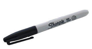
Black Sharpie Markers

You can draw, color or paint over them and they never bleed. Sweet.
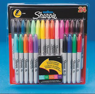
Sharpie Multi Pack
Love these too as they come in great colors and also never bleed.
Try coloring with them on a coated paper and it’s hard to stop.
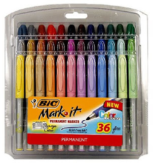
BIC Multi Pack
I found these invaluable last year when I had students use them for self portraits. There are many great skin tones in this pack: a yellow peach, pink peach, golden tans and more, all those lovely shades needed for my diverse school. Not a single student felt compromised in finding a match for their skin color. Wish I could say that for all my supplies.

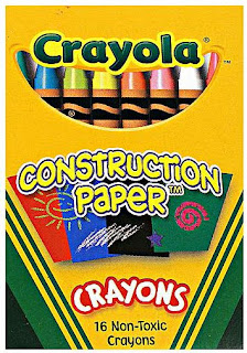
Crayola Construction Paper Crayons
Work great on colored paper, a good replacement for oil pastels for kinder and 1st grade.

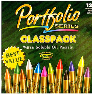
Portfolio Oil Pastels
You can get them in 12, 24-pack or a classpack. They absolutely make the best colors and students love how they seem to glide over their paper.

Dick Blick Colored Pencils
These pencils can make amazing dense colors if students really take the time to press hard while they color. Prismacolor pencils are OK – Rose brand are not as they just have no color to them. Don’t get swayed by their cheap price.


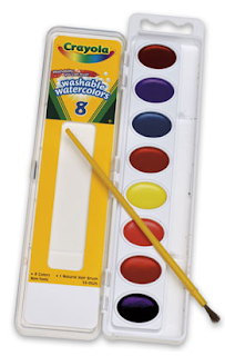
Crayola Watercolor Paint
I pop out the color tablets, dissolve them in water, and use them as liquid paint. So much better than dealing with dirty trays. About 2 – 3 tablets per spillproof cup of water seems to work the best. Tip: Store extra paint in open cups. Closed containers seem to make them age, and thus smell, faster. The paint keeps in open cups for one to two weeks.

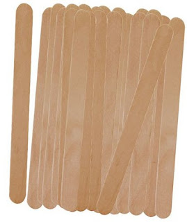
Popsicle Sticks
They come in different brand names these days, and in multiple sizes, but I’ve found them to great for more craft projects than I can mention.


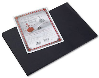
Black Construction Paper
I’ve used various brands, the point is just to make sure your paper is black and not dark gray. My public school sanctioned stuff is just charcoal and fades in a New York minute. It pays to buy the good black paper so your art has some punch to it.


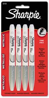
Silver Sharpie Markers
These are a treat, if you can afford them at about $1.50 each. Drawing with them on black paper was such a hit for my students last year that I’m determined to find ways to create with them again.

Read more »

Wednesday, July 28, 2010

Dubuffet Cow Drawing

Jean Dubuffet painted “The Cow with a Subtile Nose” in 1954, and I’ve always wanted to see how close I could get to the look with a good old crayon and watercolor resist. I do recommend that you have your students use a light color for the cow, and a dark watercolor to get the most contrast for their wrinkles.
1. To draw the cow, first start with a large square with rounded corners. Older students may be able to follow the placement on the paper.
2. The feet and udder are added below.
3. A neck is extended from the body and a long head is added. Ears are drawn on the side.
4. Eyes and nose are added to the face.
5. The tail is drawn on the back. Lastly parts of the rectangle are erased so it looks more like a cow body.
6. The drawing is traced with a black Sharpie, and colored very heavily with crayon.
7. The paper is crumpled up, opened up and smoothed. Repeat 3 or 4 times.
8. Dark watercolor paint is generously spread over the entire painting.
9. Rub a paper towel over the entire picture to smooth. Moooove to a drying rack and enjoy!
Read more »

Tuesday, July 27, 2010

Mini Floral Mural Set

This Mini Mural Set consists of three smaller versions of my popular floral murals. They are: a still life by Bosschaert, “Irises” by Van Gogh, and an O’Keeffe-inspired Poppy Flower. My mini murals are great for small groups, ambitious individuals or family fun. Click on this image to view the templates and finished dimensions of all three murals.

You can purchase my pdf file with instructions for $5. Click the “Add to Cart” button below to make your payment and receive download instructions.
Add to Cart
Read more »

Monogrammed Stationary

I saw this idea in an old library book, and thought it was a really nice application of your basic crayon rubbing project.
1. I started with a lettersize piece of chipboard, but any heavy paper would do. I drew my initials in block form, and cut them out of the heaviest paper I could find. Card stock works well to make a definite edge.
2. Glue the letters down with a glue stick.
3. Place a regular sheet of paper on top and rub away with one or more crayons. Rotating the direction of the rubbing helps to make all the edges really appear.
4. Write a nice old-fashioned letter to someone you care about. Thank you notes are always appreciated!
Read more »

Monday, July 26, 2010

Rousseau Tiger Mural

Henri Rousseau (1844–1910) was a French Post-Impressionist painter who worked in what was referred to as a “Primitive” manner. Rousseau was often teased by other artists because he never received any formal art education. He eventually came to be recognized as a self-taught genius whose works are of high artistic quality. Click HERE to see Rousseau’s original painting, “Tiger in Tropical Storm”.

My pdf file is made up of a 28 pages and measures 48" x 36" when complete. You can purchase my pdf file with instructions for just $5. Click the “Add to Cart” button below to make your payment and receive download instructions.

Add to Cart
Read more »

Sunday, July 25, 2010

City Block One-Point Perspective Drawing

One of the CA Arts Standards for 5th graders is one-point perspective drawing. To be honest, I’ve struggled with covering this concept in the past with just one 50-minute class. After discussing what it means to have a “vanishing point” in their drawing, I once had students make their own guidelines to follow, only to have much of the class not get past this point. And I once tried pre-printed guides, only to find they get confusing and end up being too much information that can’t be erased. This year I’m going to try starting with this series of squares, which you can download here. I think it will give students the angles they can see to follow their own vanishing point, without overwhelming them with too many lines.
1. Just the fronts of their buildings are drawn in each square, leaving room for the rest of the building.
2. A vanishing point can be inside a picture or outside, which is true for this guide. The students should visually follow where all the angled lines on their guide would intersect off the paper so they can picture where their vanishing point is. The sides of each building are drawn, making sure that they all point to this imagined vanishing point. The sides of the city blocks will help guide them.
3. The ends of the buildings are connected to finish the buildings. It’s best, of course, to start with just simple cube-shaped buildings before more complex ones are taken on. Some blocks may just have trees, if desired.
4. All of the drawing is traced with an ultra fine point marker, and colored in with pencil crayons.

CA Visual Arts Standard: Grade Five
2.1 Use one-point perspective to create the illusion of space.
Read more »

Saturday, July 24, 2010

Cezanne Meets Matisse Mural

Paul Cezanne was a French artist whom Matisse and others considered the father of post-Impressionism. This mural honors both artists by combining Cezanne’s subject matter with Matisse’s vivid color palette.

This mural has 24 pages to color and is 42" by 35" when complete. You can purchase my pdf file with instructions for just $5. Click the “Add to Cart” button below to make your payment and receive download instructions.

Add to Cart
Read more »

Friday, July 23, 2010

Andy Warhol Soup Cans

Andy Warhol’s Campbell’s Soup Can painting has come to symbolize the pop art movement.
WEEK 1: Give the students a 9" x 12" sheet of paper, along with a 5" wide oval template that is the shape of the top of a can (in perspective). Show them how to trace one oval at near the top of the paper, slide the oval down about 7" and trace again. Connect the outside edges, erase the curve that will not show, and add the same curve to the middle of the can. After this, it is helpful for them to look at a Campbell's label to add details in their own style. I encouraged students to make up their own “flavor” and to cover all their pencil lines with a thin black marker.
WEEK 2: Prep work is needed here. Each student’s art needs to be xeroxed down 50%, and then duplicated 4 times. The students will then take all 4 copies of their original art, paste them down in a grid, and colored them in with colored pencils.
Read more »

Thursday, July 22, 2010

Another Popsicle House

I’m still loving these little popsicle sticks, and made a variation of my other house project I posted here. This one has a more vertical, paneled look instead of the horizontal, log cabin look.
1. These little popsicle sticks I found at JoAnn Fabric’s, and are about 2 1/2" long. I started by lining up six sticks, and cut the ends off of two more so they could be glued to the back without showing as shown in diagram 1.
2. The roof starts with a frame as shown in diagram 2. Let dry.
3. Cut progressive ends off three more sticks so they can fill in the roof as shown. Let dry.
4. Glue and attach roof to house as shown and let dry.
Read more »

Tuesday, July 20, 2010

Dubuffet Self Portrait

Jean Dubuffet (1901-1985) was a French painter and sculptor who preferred what he called “raw art”. This came from non-professionals who worked in very primitive ways. He routinely added sand, tar and straw to his paintings to give them an unusual texture. His playful style is fun to imitate and can encourage some very creative portraiture.
1. Start by sketching a large simple drawing of yourself on a sturdy piece of paper. No tiny details, just outline of hair, eyes, nose, shoulders, etc. Draw a few horizontal and vertical lines on the body, hair and face to divide up the areas into smaller parts. Keep in mind that the lines will be traced with a glue bottle so tiny details are not necessary.
2. Make a mixture of 50/50 white glue and black acrylic paint in a squirt bottle, and shake to blend. Trace over all the pencil lines with the black glue. Remember that Dubuffet liked rough looking images so wiggly black lines that are sometimes thin and sometimes thick are what you are trying for. Let the glue dry overnight.
3. A lot of Dubuffet’s paintings were done with just red, white and black colors, so I limited myself to a red and black Sharpie, and randomly added stripes in some areas, and solid colors in others. Some spaces may also just be left white.
Read more »

Monday, July 19, 2010

Recycled Mosaic Picture Frame

I love the look of stone mosaic art, but it is expensive and not really practical for young kids. I thought I’d try a variation of this idea I saw online using old plastic cards instead. Between gift cards, rebate cards, and club cards, it’s pretty easy to collect these without really even trying.
1. I started with 8 jumbo popsicle sticks, and glued them together with white glue as shown. Let dry.
2. Cut several plastic cards with a scissors into strips that are just a bit thinner than the width of the stick. Cut across the strips to make the most even and equal-sided squares that you can. Glue these onto the frame with white glue, leaving a small amount of space on either side.
3. If you like the frame with the round ends showing, stop and find or make some art for the center. I wanted a more modern look so after the squares were dry, I used a large scissors to cut the ends off flush.
4. Fill your frame with a photo, drawing, or your favorite quote. To hang, apply a stick-on hanger (available at most craft stores) on the back.
Read more »

Drawing Practice

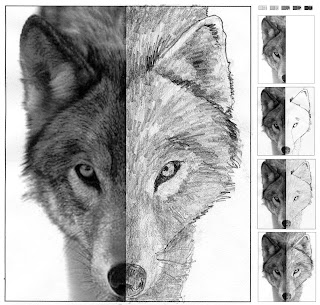
When students have a photo to refer to, I think they are often pleasantly surprised at what they can draw. This is one of my “Finish the Picture” templates, where the students are asked to fill in, shading and all, the missing half of a photographed face. I’m happy to share my wolf template with everyone HERE.
1. The students first practice their shading by matching the values of the grays at the top of the paper. The goal is to have them see they can make not only dark and light pencil shades, but medium light and medium dark as well.
2. The drawing starts with finding and drawing as many edges of the face as possible. The eyes and nose are pretty easy to see, but the ears take a little more time.
3. This wolf has a mostly medium gray base to him, so once the edges are in place, the entire wolf is shaded lightly with the side of the pencil. Students should be reminded to keep the direction of this sketching the same direction as the fur. No quick shading in one direction just because it is faster; nice drawings take time.
4. Lastly, the students need to look for really dark areas that they should fill in with heavy pressure. One tip is turning the drawing upside down to get a fresh look at it. I’d love for students to learn they can draw in layers like this, which encourages a greater depth to their shading. Sketches with lots of light, medium and dark tones make for a much more interesting picture than those without.

CA Visual Arts Standard: Grade Three
2.4 Create a work of art based on the observation of objects and scenes in daily life, emphasizing value changes.
Read more »

Sunday, July 18, 2010

U.S.A. Map Mural

Here’s a little more of a practical application for creating a large mural for a classroom. Many elementary students study the US states and their capitals, so I thought that a large map might make a good aid for all kinds of classes, be it art or geography. It could be colored as a diagram, or with mountains and trees to show some topography, lots of possibilities.
My 30-page pdf file creates a mural that measures 60" wide by 38" tall when complete. Click HERE to see a preview of the blank template. You can purchase my pdf file with instructions for just $5. Click the “Add to Cart” button below to make your payment and receive download instructions.

Add to Cart
Read more »

Friday, July 16, 2010

Popsicle Stick Log Cabins

These new little popsicle sticks (they’re 2 1/2" long) that I found at Michael’s remind me of my parent’s log cabin in Tennessee. Here’s one way to make little houses that could serve well as colorful refrigerator magnets. Or add some snow and a string for a holiday decoration? Let your imagination see what it can come up with.
1. Follow the steps shown in my small diagram above. I like using Aleene’s Tacky Glue to connect all the sticks as it is thicker and seems to set up faster. Start by gluing 6 sticks onto two, and try to make the bottom edge flush and the top with a bit of stick still showing.
2. Cut three pieces at an angle as shown, and glue to another stick. I used a heavy scissors and it took a lot of pressure, so I wouldn’t advise that kids try to cut this.
3. Glue the two sections together and let dry.
4. With an Ultra Fine tip black Sharpie, draw some details on the front of the house.
5. Use a crayon to color the front of the house.
6. Glue the final two roof sticks on top. Glue magnets on the back, if desired.
Read more »

Wednesday, July 14, 2010

Mosaic CD Coaster

I found this great idea over at Mini Matisse, who got it from an organization called ArtStart. I love how the plastic case makes a nice sturdy frame to work with, and the clear closure lets you just admire the colorful beans when you are done.
1. Several varieties of dried beans are needed, just test them first to see they are not thicker than the CD case before you start to glue. With a standard CD case open and the tray removed, I used a flat brush to spread a generous line of Mod Podge around the outside edge of the case. I lined up one row of beans on this, pushing them against the lip to make a straight line. The 1/2" or so where the spine used to be needs to be left clear though as the front of the case will not cover it up when closed.
2. After the outside row was complete, I painted another line of glue inside it, and lined up another row of beans. I found that this process of working from the outside in really seemed to help control all these wiggly little round shapes. I made a total of four rows or rectangles before I just filled in the remaining center with glue and the smallest beans.
Read more »

Bandage Halloween Head

Halloween can offer lots of creative drawing opportunities, some even with valuable art principals. I got this drawing idea from a piece of clip art, and found that it helped to teach students how to make a round head look more dimensional, simply by adding curves instead of flat straight lines.
1. I made cardboard head templates to help my students get started. After they traced it in the middle of their paper, they drew one large eye, two circle dots for the nose, and a mouth. For the bandages, they made several curvy lines across the face. I demonstrated on the board how curvy lines would add roundness to the head, and how straight ones would simple make it look flat. To finish, any “unbandaged” area could have a few lines added, going in other directions. The goal was to have the face look like it was completely covered, without too many lines that would be hard to color in.
2. When the drawing was complete, all the pencil lines were traced with a fat black Sharpie.
3. All the areas of the face were then colored in with Crayola Construction Crayons. These work great on colored paper and almost give the look of pastels without the mess.
4. The face was cut out and glued onto a different color piece of construction paper.

CA Visual Arts Standard: Grade Four
2.1 Use shading (value) to transform a two-dimensional shape into what appears to be a three-dimensional form (e.g., circle to sphere).
Read more »

Tuesday, July 13, 2010

Oil Pastel Klee Portrait

Paul Klee was a Swiss artist from the early 1900’s who liked to turn things into simple geometric shapes. This sample is based on his “Head of A Man” a classic example of his philosophy.
1. Make a 7" round cardboard template for the students to trace in pencil in the center of a brown or tan 9" x 12" paper. Then have them add the neck and shoulders using straight lines and angles, only.
2. To draw evenly spaced eyes that touch, I often have the students first draw three evenly spaced dots that they connect with curves. Circles are added inside. Using a ruler, show the students how to draw about 5 intersecting lines across the face that “jump” over the eyes. The body may have 2 or 3 lines added also. The mouth is just a simple rectangle with a horizontal line through it.
3. When the drawing is complete, all the pencil lines are traced with a thick black Sharpie marker.
4. All of the closed shapes are now colored in with oil pastels. The goal is to have lots of different colors without any of the same touching each other.

CA Visual Arts Standard: Creative Expression, Kindergarten
2.6 Use geometric shapes/forms (circle, triangle, square) in a work of art.
Read more »

Masterpiece Coloring Book 3

My “Masterpiece Coloring Book 3” includes ten pages in simple line form for coloring with room to add personal touches. Students can color the pages to look like the original painting (left), or they can have fun adding modern touches (right). A game of “What Doesn’t Belong?” could be played after coloring. The beach ball and checkered blanket are easy to spot, but what about the wristwatch on the woman’s hand? Lots of possibilities.
As in books 1 and 2, I have continued to
scale these drawings to fit on 8" x 10" canvas, if desired. Click HERE for mounting instructions. Click HERE to preview all ten pages of Coloring Book 3. Top row, left to right: “Joie de Vivre” by Delaunay, “Farbstudie Quadrat” detail by Kandinsky and Optical Art. Middle: “Sunday Afternoon in the Park” by Seurat, “Starry Night” by Van Gogh, and Ode to Matisse. Bottom: Large Flower in the style of Georgia O'Keeffe, “Castle and Sun” by Paul Klee, “Irises” by Van Gogh and “Street on Tahiti” by Gauguin. You can purchase my pdf file with instructions for just $5. Click the “Add to Cart” button below to make your payment and receive download instructions.

Add to Cart
Read more »

Monday, July 12, 2010

My Summer Self Portrait

I'd been exploring ideas for a back-to-school project combining art with story telling much like a popular art journal technique, in larger scale. This project which combines a self portrait with a composition about the students summer experience has become wildly popular with the kids and their teachers as a great kick-off to the school year.
1. Click HERE to download a blank letter-size body template. If you can Xerox on tabloid paper, copy the template at 125%.
The larger sized paper is always easier for students to work with.
2. Have the students add all of their personal details including facial features, hair and clothing and their names, in pencil. When complete they're to trace over all pencil lines in black Sharpie marker.
3. Next, have the students use ballpoint pens to write their compositions in the background. In the interest of time, advise the students that neatness is not essential and to cross out or overwrite any errors.
4. Lastly, give the students liquid watercolors to complete their pictures.
Read more »

Sunday, July 11, 2010

Watercolor Collage

I love what torn edges do for a project, even though most students seem resistant to it. I think it maybe just takes time to trust that “happy accidents” sometimes happen with this process.
1. Give each student two sheets (I used 9" x 12") of watercolor paper and watercolors. One sheet is to be filled with one color, leaving a border around the edge (I used blue). The other sheet is painted with lots of large patterns and colors of paint. Let dry.
2. Have the students take their patterned painting and tear it into different size pieces of squares and rectangles and strips. Arrange them on the solid paper in a pleasing way and glue them in place with white glue.
3. Cut pieces of yarn and arrange on top of the artwork. I made a sun and rays and a few more lines. Glue in place and let dry.
Read more »

Friday, July 9, 2010

New Butterfly Mural

My New Butterfly Mural combines a few of my favorite ideas. The butterfly theme is my most popular, so I decided to scale this new version to fit on stretched canvas, as shown in permanent marker (left.) Oil pastels on paper (right) is always a quick and easy option.

My pdf file includes a 15 page version to fit a 36" x 24" canvas and a 28 page version to fit a 48" x 36" canvas. These are standard sizes and easy to obtain, should you choose to go that route. Click HERE to see a preview of both templates. My file includes illustrated, step-by-step instructions on how to fuse a permanent marker drawing to canvas. You can purchase my pdf file with instructions for just $5. Click the “Add to Cart” button below to make your payment and receive download instructions.

Add to Cart
Read more »

Tuesday, July 6, 2010

Watercolor Resist Patterns

Kindergarteners learn about patterning, and this is a colorful way of reinforcing the concept.
1. I recommend watercolor paper be used, if possible, as it really does make a difference in the color brightness. Prep 9" x 12" sheets by drawing marks on the top and bottom every 2 inches across. Ask the student to connect the marks with a pencil so that they have 5 panels on their page. Trade the pencil for a crayon and ask them to trace the pencil lines.
2. Show some examples of line drawing patterns that they can choose from (circles, squares, hearts, stars, etc.) The students are to choose one type of pattern for each panel, and then draw each directly with a crayon.
3. I like to dilute watercolor tablets in water and give students liquid paint to fill each panel. They students are to paint each panel a different color, or a pattern of colors.

CA Visual Art Standard: Creative Expression 2.1
Use lines, shapes/forms, and colors to make patterns.
Read more »

Monday, July 5, 2010

Birch Trees

Variations of this project are often posted on Artsonia.com, but I like the subtle colors that come out in this version by painting with a toothbrush.
1. Each student starts with a 9" x 12" sheet of watercolor or heavy paper. They are to tear off six strips of 1 1/2" wide painter's masking tape at various lengths from 6" to 7" long. Then, carefully tear each piece of tape down the middle and attach each joining the straight edges so that the outer edges are rough. Note: Overlapping the shorter lengths will create narrower trees for enhanced depth of field, as shown. Place the pairs randomly on the watercolor paper with top ends touching the top of the page. Press all of these “trees” down firmly.2. Using acrylic paint, dip a toothbrush in green paint and hold over the paper. Rub a thumb over the bristles so that paint splatters onto the paper. Don't worry about smudges as they will look like clumps of grass. Repeat until the bottom grass area is filled. Wash the brush and repeat with blue for the sky above.
3. After the paint has dryed, carefully peel away tape to reveal white trees. Water down black paint until it is very thin. With a brush, paint a gray vertical stripe on the white tree to represent the shadow. Repeat on all the trees, always keeping the shadow on the same side of the tree.
4. With thick black paint, paint small horizontal marks randomly on the trees.
Read more »

Sunday, July 4, 2010

Masterpiece Coloring Book 2

My “Masterpiece Coloring Book 2” includes ten pages in simple line form for coloring with room to add personal touches. Also included is a new feature. Each is scaled to fit on an 8" x 10" canvas, if desired. This post includes detailed instructions for mounting. Click HERE to preview all ten pages.

Top row, left to right: Chinese painting by an unknown artist, “The Birthday” by Chagall, “The Wave” by Hokusai. Middle: “Portrait of Jeanne Hebuterne” by Modigliani, “Color Studies” by Kandinsky, “Sunflowers” by Van Gogh and “Little Dancer” by Degas. Bottom: “The Creation of Adam” detail by Michelangelo, “The Birth of Venus” detail by Botticelli and “Tahitian Women" by Gauguin.

You can purchase my pdf file with instructions for just $5. Click the “Add to Cart” button below to make your payment and receive download instructions.

Add to Cart


How to Apply a Drawing to Stretched Canvas
SUPPLY LIST
Dry Wax Paper: 10"x10" or larger, from restaurant supply store or Amazon.com
A drawing to trace, or make your own in a 7.5" x 9.5" paper
One 8" x 10" stretched canvas
Permanent Markers: Sharpie and/or BIC. No waterbased.
White glue (not pictured), Elmer’s or other brand are fine.
Scissors and paint brush (not pictured)


STEP ONE
I centered and taped my dry wax paper over my Van Gogh Sunflower drawing that is part of my Book Two collection. Referring to a photo that I found on the internet, I traced the lines and filled them in to match the original as best I could. When the coloring was complete, I removed the template back and trimmed out the wax drawing near the edges.


STEP TWO
To apply your drawing so that it really “hugs” your canvas, follow these application steps carefully. I’ve learned that the best way to prevent bubbles is to first apply your glue mixture (50/50 glue and water) to the canvas front. Be generous so there are no visible dry spots.


STEP THREE
Apply the glue mixture to the back of the wax drawing. Again, be generous so that there are no visible dry spots. I’ve supervised this step with young students as they tend to miss spots.


STEP FOUR
Center the wet drawing on the canvas, right side up. Smooth, and apply more glue mixture on the front.

STEP FIVE
Smooth out any air bubbles that you see with your brush and or your fingers, if necessary. You may still see some wrinkles remaining as shown above. Not to worry, these will go away as the paper dries and shrinks.

This is how the canvas looks when the paper is completely dry. Smooth city! This is a great way to make drawings look like they were created directly on canvas, which given the texture, is difficult to do. Also, students can make sure they have art they like before permanently mounting it. If anyone has results they would like to share, please email me your pictures. Enjoy!
Read more »