Total Pageviews

Sunday, October 31, 2010

Student Art from Minnesota

Last week I received this wonderful photo from a 4th grade class in Royalton, Minnesota. Their teacher, Erin, had tried out my Picasso Paper Bag Costume project with her entire class and agreed to share her results. Are these a bunch of cute and creative kids or what? I love all the colorful faces and the animated posing too, it really makes for a wonderful photo. Thanks kids, for letting me share your art with my readers.
Read more »

Saturday, October 30, 2010

Sir Ken Robinson on Education and the Arts

Read more »

Scarecrow Painting

I found this idea of a watercolor scarecrow over at Artsonia.com. If anyone would like credit for the idea of drawing him in this closely-cropped fashion, please let me know. I love how my students could easily make a large detailed face, but still include faraway fields and trees too.
1. Students began with an 11" x 15" piece of watercolor paper. I wanted them to get set up with the outline of the body and head before they started customizing, but being that I had many kinders (this was an afterschool class) I knew they would tend to make the shapes very small. To compensate, I had students make their own guides. I had each one align an extra 8.5" x 11" sheet of paper with the bottom of the watercolor paper, and use the top as a guide to draw the horizontal arm line.
2. To make the head, I had cut and folded 5" squares of newsprint into quarters. A cutting line on one side showed them where to cut to turn the square into a 5" circle. This paper circle was placed and traced on top of the arm line, near the right side of the paper.
3. The students drew the arm opening on the left, making sure the body would be centered under the scarecrow head. The rest of the drawing details were added and traced with a dark crayon.
4. I told my students they could color in small shapes in their picture with crayon and the big shapes with watercolor.
Note: I had great results with the project, I think due to the fact that the students were set up first with drawing the large body shapes. It is also the third time now that I have used my new Dick Blick Liquid Watercolor set, and I absolutely love the results. SO colorful and such a nice palette to work with. I’m a convert now and know what is going on my next teacher “Wish List”.
Read more »

Friday, October 29, 2010

Fall Tree Painting

The basic concept behind perspective is learning that the further away objects are, the smaller they appear. This painting idea comes from one of the Usborne art books, all of which I am very fond of.
1. The students need a set of watercolor paints and good brushes (including small thin ones for detail work). They can start by painting an off-center tree, with trunks and branches. Remind them that trees tend to make forks and split off again and again as they grow up.
2. Colored leaves in varying sizes are painted next. Some may be left on the tree, some floating away or even off the page, and a few extra large ones. Some details may be added with the brown paint used for the tree.
3. If you have time, let the tree and leaves dry before proceeding. The grass may be painted next, taking care to go around the leaves.
4. Finally, a sky fills in the background.
Read more »

Thursday, October 28, 2010

Haunted House Coffee Painting

I saw this idea in a recent Arts & Activities magazine, and loved the look. I thought a haunted house would be a good subject matter because of all the moody brown tones that could be created.
1. Halloween can be such a mixed bag when it comes to art lessons. I like spooky fun, but have seen more than my fair share of RIP headstones, etc. I set up rules that this project was to be 'drawn' with a paintbrush (so the kids wouldn't draw tiny shapes they couldn't paint) and that it was essentially a landscape (no ghosts, no zombies, headstones, etc.). Each student got a sheet of paper, thin brush, water and a tablespoon or so of instant coffee.
2. The students were to dissolve bits of instant coffee with water on a plate. I showed them how to paint a horizon line, and then “draw” an old-fashioned house on top.
3. After the outlines were done, the students filled in the painting by making as many different tones of brown as they could. Their finished painting should have a range of white to light to medium to almost black-brown. I loved this idea from Arts & Activites - where else can you get cheap instant paint?
Read more »

Wednesday, October 27, 2010

Day of the Dead Skull Drawing

Day of the Dead is a holiday celebrated in Mexico and Latin American on Nov. 1st and 2nd. The holiday focuses on gatherings of family and friends to remember friends and family members who have passed on. I like how the festivities include lots creative imagery with patterns. This project was inspired by a Day of the Dead postcard which featured a very patterned skull drawing.
1. In order to get the students drawing their patterns as soon as possible, I made cardboard templates of skulls for them to trace with a pencil on a black piece of paper. I reminded them that when they drew their eyes, they should be in the middle of the head, sitting on a imaginary line across the center, not up in the forehead. The triangle nose is halfway down, and the mouth halfway down again. I find you can’t remind students often enough about these feature placements. There is just some natural tendency for some to draw their eyes up in the top half of the heads.
2. Once the features were in their correct place, I gave each student a silver Sharpie marker and had them trace their lines. They could then draw in whatever patterns they wanted, I just stipulated that all shapes must be balanced to make the drawing symmetrical. If they drew a flower on a left cheek, they had to draw the same flower on the right. I think this is a good introduction to symmetry for those as young as first grade. Older students can get the idea reinforced,
3. The students were instructed to fill the face with as many symmetrical shapes as possible. When spaces got smaller, they could make lots of circles, and when the spaces were smaller still, they could fill them in with dots.

CA Visual Arts Standard: Grade Four
2.2 Use the conventions of facial and figure proportions in a . . . study.
Read more »

Tuesday, October 26, 2010

Symmetrical Owl

This project fulfilled all my criteria for a successful lesson today: it was seasonal, a visual art standard (symmetry) was covered, and it really peaked all the student’s interest.
1. To make a pattern, I gave each student an 8.5" x 11" sheet of old newsprint and had them fold the paper in half the long way. They then drew the outline of a simple owl as shown, making sure the center was on the fold of the paper. With the paper still folded, they cut the owl out.
2. The newsprint owl was centered on a sheet of 9" x 12" sheet of black paper and traced around the edge with a pencil. Working only on the black paper now, the rest of the owl was drawn. I recommended starting with the brow lines, then the centered diamond beak, then the eyes and then wings. The goal was to have the owl drawn as symmetrically as possible.
3. When the drawing was complete, the students traced the pencil with a black oil pastel. To color the owl, I required that they use realistic colors (brown, white or gray).
4. After the owl was thoroughly colored (no paper showing) the students cut them out. One teacher opted to tape groups of them to long ribbons so they could hang in her room – lots of possibilities for decorating.

CA Visual Art Standard: Grade Two, Creative Expression
2.5 Use bilateral or radial symmetry to create visual balance.
Read more »

Monday, October 25, 2010

Cubist Paper Bag Costume

A Halloween book that included faces on paper bags inspired my “Cubism” costume. I can’t wait to wear it in our school parade on Friday.
I used a regular brown grocery bag, and started by drawing the split face on one side with a black pastel. For more specifics on how to draw the two-sided face, check out my post here. After the features were drawn in black, I colored white pastel to fill in the background and cover over any logo art. (My Portfolio® brand pastels are pretty opaque.) I continued drawing the hair around the sides, top and back of the bag, always coloring very heavily. Lastly, I poked two eye holes near the bottom of my nose. I won’t be running any races with this on, but I do think I can make it around the playground once or twice. Hope this helps others that need a last-minute costume!
Read more »

Sunday, October 24, 2010

A Positively Negative Pumpkin

I tried this with 2nd and 4th graders, and they both seemed to enjoy the puzzle aspect of making a whole pumpkin from cutting out just a half. I like how this is an example of using both positive and negative shapes, and positive and negative colors.
1. Give each student an 8.5" x 11" sheet of cream paper and a 5.5" x 8.5" black sheet of paper. With my sample, I first aligned the black paper on the left side of the cream.
2. Starting on the middle edge, students draw a large half of a pumpkin. Next, one eye and one half of a mouth are added. When complete, the eye and mouth are cut out, all as complete shapes, not in bits and pieces. I show students how to cheat with the eye triangle by cutting a line over to it and then cutting around to get the triangle out. The little slice will seal itself back up when glued.
3. The negative shape is glued down on the left, and the newly cut shapes are to be flopped from their cut out positions, and then glued down with a glue stick on the right.
4. Finally, the students could add some detail to their pumpkin, using black marker on the cream side, and white colored pencil on the black side.

CA Visual Arts Standard: Grade Four, Creative Expression
2.6 Use the interaction between positive and negative space expressively in a work of art.
Read more »

Saturday, October 23, 2010

Pumpkin Festival Photo Op

My school's biggest annual fund raiser is our Pumpkin Festival. With Halloween themes galore, I decided to blow up my mural of “The Scream” to create a fun photo op.
1. I printed my mural templates at 130% on 11" x 17" 65 lb. cardstock.
2. The pages were colored in, trimmed off and taped together from behind. I used clear packing tape to handle the additional size and weight.
3. To mount, I taped together four 30" x 40" sheets of 1/2" thick foam core. I taped over the seams on both sides with duct tape and reinforced the back by taping down four 3' wood dowels.
4. I layed out the finished mural on the front to measure the excess foam core. I marked my cutting lines and trimmed with a box cutter.
5. With the mural now laying flush to the edges of the foam core, I folded over half of the mural, applied spray adhesive to the mural back and foam core and rolled the mural back into position. I then glued the other half down in same manner.
6. I used black duct tape to smooth the outer edges while creating a nice, even frame.
7. I used my box cutter to trim an oval out of the face and added a little more duct tape to smooth over the back edge of the oval.
Read more »

Friday, October 22, 2010

Contour Fall Leaves

Contour drawings are made with just lines, which also add a bit of visual energy to this picture.
1. I started by making a sheet of line drawings of different leaf shapes, which you can access here. Give the students one print of these leaves, and one matching-size blank paper. Have the students trace several leaves on their paper (if they can see through their paper) or use carbon paper to transfer the lines.
2. Once the blank paper has been filled up with about 3 leaf shapes, they are to be traced with black marker and colored in with colored pencil.
3. Lastly, each leaf is traced around with a colored pencil, following the edges of the original, and expanding as they proceed. As the shapes grow, they will eventually bump into the other leaf shapes and the students will have to decide which ones are in front and which are in back.
Read more »

Thursday, October 21, 2010

Halloween Monster Gloves

OK, so maybe this is more craft than art, but Halloween can be a great time to challenge your creative muscles. And if I could inspire even just one person to make something instead of buying that awful ready-made stuff in stores, I will be a happy camper.
1. The key is finding fake fur from fabric stores that matches the color of some knit gloves. I think that all black or all white are the easiest to look for. I cut the largest square of fur possible for the top of the glove, and hand-stitched in place. I think you could glue, but would need to put some kind of divider inside the glove to keep both sides from gluing together. If you really want to get "hairy", also add a small strip on the top of the thumb.
2. Once the fur is on, you need some stiff craft felt in the color of your desired fingernails. These are cut out and glued on also, taking care to keep the glue just on the top of the glove. Try making the nails really pointy for an extra scary look!
Read more »

Wednesday, October 20, 2010

Bone Letters

You could make this a lesson about anatomy and what the different kinds of bones in your body look like – or you could just make some creepy looking name signs for Halloween!
1. I drew examples of some typical bones on the board. They generally look like sticks, but have large bumps on the end. I gave students long pieces of paper and had them write their name lightly in pencil, using just stick letters.
2. The students can then turn those letters into little sections of bone as they see fit. Curved letters can be made from several short straight ones, or something that looks like a rib bone, which has just a rounded point on one side.
3. Trace all the pencil lines in marker and add shading by using cross-hatching to one side.
Read more »

Tuesday, October 19, 2010

Black Cat with Glowing Eyes

These glowing cat eyes are made from blending a few layers of pencil crayons. White on the bottom, then yellow, and for those interested in more detail, a bit of brown. Please note though, that the average pencil crayon and black construction paper won’t deliver these results. You need crisp black art paper and soft pencil crayons, such as the Prismacolor or Dick Blick brand to get the rich color against a very black background.
1. I gave the students a 7" square of black art paper, and had them follow my drawing steps, as shown above.
2. When complete, they traced all their lines with a white pencil crayon.
3. The students added a heavy layer of white pencil crayon around the pupils, and then added a golden yellow on top. Older students were shown how to add a bit of brown near the top edge to create a bit of a shadow.
Read more »

Monday, October 18, 2010

Halloween Pasta Skeleton

A fun way to teach students how to apply basic anatomy to art is by creating skeletons from pasta.
1. To make a sturdy pallet, the students arranged 20 popsicle sticks horizontally and secured them with 4 sticks glued vertically to the back.
2. A variety of pasta shapes were needed. I started by briefing the students with a simple sketch illustrating the proportions and the placement of shoulders, hips and joints.
3. Using white glue, they started by placing the head, spine, ribs and hips. They then added the shoulders, arms, legs, hands and feet and let dry until the glue turned clear.
Read more »

Sunday, October 17, 2010

Jack-O-Lantern Painting in the Round

Most kinders have trouble drawing large free-hand circles on rectangular paper. For this project, inspired by a window decoration I recently spotted at a paper store, I pre-cut the paper to help guide them to make a better circle.
1. I started with orange 65 lb. card stock and used my circle cutter to cut out the circles approximately 8" in diameter. Printing and cutting by hand is of course and option.
2. In pencil, the students drew their circles about an inch or so from the edge and then added the stem and the rest of the features.
3. I gave each student a sheet of plastic canvas and a peeled black crayon to do a light rubbing over the entire surface to add texture. They then added shadow by doing a rub around the outer edge of the paper.
4. With a small paintbrush, all of the detail lines were painted white with either tempera or acrylic paint.
5. The insides of the mouth and eyes were painted in dark orange.
Read more »

Saturday, October 16, 2010

Halloween Drawing

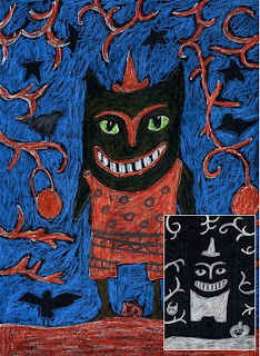
I love the layering technique behind this drawing, which I learned from a colored pencil tutorial. Please note that not just any colored pencil will do this, just ones like these from Dick Blick. The average school-quality brand are just not soft enough to blend together.
1. Last Halloween, I found some colorful clip art images for the students to use as inspiration. Trees with wiggly branches, crow silhouettes and and funny monsters can all be drawn in different configurations to make a very interesting picture. I asked the students to sketch out their own designs in pencil on black paper. Note: It pays to buy some serious black paper from an art store, the average black construction paper is too soft and fades like crazy.
2. After the design is done in pencil, they are to pick the large shapes in the foreground, and color them all in with white pencil crayon. Press hard to make the white very bright.
3. When complete, the foreground shapes get their final color on top of the white. Firm coloring is needed again to cover all the white.
4. The background is colored in with just one layer of pencil crayon, which makes it a little dull and thus visually recede. Encourage the students to keep some shapes black, which adds a lot of contrast and interest to the picture.
Read more »

Friday, October 15, 2010

Designer Wallpaper Skulls

I recently received a large wallpaper donation at my school, and have decided to show the students how to cut out “designer” skulls.
1. I will give the students a sheet of wallpaper approx. 8.5" x 11". They are to fold it in half the long way, and draw 1/2 of a skull on the fold, making it as large as they can in both directions. The skull is basically an oval head with a narrow chin.
2. With the skull still folded (right sides together) they draw one eye halfway down the skull, half of a triangle nose, and half of some shape of mouth. These shapes are all cut out, still on the fold. For the eyes, I just cut straight over to the eye, and then around it. The slit that was made disappears when glued down.
3. The skull is glued down to a sturdy piece of white paper with a glue stick. I want the students to then color in the background of the skull with Sharpie makers, repeating any of the design elements they see in the paper.
Read more »

Wednesday, October 13, 2010

Glue and Pastel Spiderweb

This basic glue and pastel process can be used with a variety of subject matter - this spiderweb worked well for little hands that were just learning how to control a glue bottle.
Week One: Distribute 9" x 12" sheets of black construction paper to each student. Ask them to make a dot with a pencil somewhere near the center of the paper. Show them how to draw straight lines out from the center, going to the edges of the paper: about 2 lines up, two to the right, then the left and the bottom edge. Next, they need to draw a series to concentric circles around the center dot. Encourage the students to keep the lines simple, with lots of space in between. Distribute a bottle of white glue to each and show them how to trace all their pencil lines. To keep control of the glue line, it helps to keep the nozzle dragging on the paper when they squeeze.
Week Two: After the glue has dried, give the students chalk pastels, and show them how to color on the paper, and then blend the powder in with their fingers. Rubbing is essential as it blends the chalk into the paper, and cleans it off the glue.
Read more »

Tuesday, October 12, 2010

Witch Hat Drawing

A Halloween stock art image inspired me to make this witch hat drawing. It’s a good example of using positive and negative space in a very seasonal manner.
1. I started with a 6" x 9" piece of black drawing paper. I made a dot on the top center, and drew a hat that touched it and the two bottom corners. A band and star were also drawn in pencil.
2. I traced all the lines with a white Prismacolor pencil, and then shaded in the outside (negative) areas white. Sometimes this is also called “underglazing” a drawing. Note: Crayola pencils will not work for layering, they are not soft enough. Test your pencils before you try this lesson.
3. Orange and yellow pencil color went on top of the white, and also on the band and star. I experimented with adding pressure with all the pencils to get the maximum burst of color.

CA Standards of Visual Arts: Grade Four
2.6 Use the interaction between positive and negative space expressively in a work of art.
Read more »

Monday, October 11, 2010

Gilded Halloween Portrait

I found a great book simply called “Halloween” by Joanne O’Sullivan, which has a ton of creative ideas. This is an adaptation of a portrait project, which I am including in an after-school class next month.
1. I started with one of those super-inexpensive unfinished frames from Michael’s. had some iron-on appliques in my stash of supplies. You could probably buy something similar from JoAnn’s. You just need something that looks decorative to imitate the look of a fancy old picture frame. I covered my frame with a thin layer of Mod-Podge, placed the appliques on top, and let dry.
2. When the frame was dry, I applied a generous amount of metallic gold acrylic paint on top, taking care to get paint in all the edges and on the sides.
3. I took a digital picture of my handsome son, turned it to a black and white image, and printed it out as a 3.75" square on some good matte Epson paper. To make the face look painted, I filled it in with colored pencil and added some detail on top. I can imagine printing out several copies for kids to work on so they could pick their favorite. I like the way this turned out and can’t wait to try it in a few weeks!
Read more »

Sunday, October 10, 2010

Day of the Dead Drawing

Day of the Dead (Día de los Muertos) is a holiday celebrated in Mexico in which family and friends pray for and remember friends and family members who have passed away. It occurs every November 2nd in connection with All Saints’ and All Souls’ Day celebrations.
1. Starting with black construction paper, show the students how to draw in pencil a large skeleton head, which looks a lot like an upside down pear. Circles are added for the eyes, a triangle for the nose, and rectangle with lines for the mouth. A skinny neck and shoulders are added.
2. After the pencil drawing is complete, the students are to take white glue and trace all the lines. Let dry for at least 24 hours.
3. Oil pastels are used to color in all the shapes made with glue.
Read more »

Friday, October 8, 2010

“The Scream” Mural by Edvard Munch

The Norwegian artist Edvard Munch is regarded as a pioneer in the Expressionist movement in modern painting. This mural of his famous “Scream” painting features color callouts on every page so this sample may be reproduced as shown, just in time for some Halloween fun.
My mural has 36 pages to color and measures 45" x 55". You can purchase my pdf file with instructions for just $5. Click the “Add to Cart” button below to make your payment and receive download instructions. Note: Color callouts on the mural come from the Portfolio® Oil Pastels, specifically the 24 set as shown here.

Add to Cart

Read more »

Thursday, October 7, 2010

Watercolor Crayon Resist Leaf

This is so simple but really makes a beautiful image. There's a texture rubbing involved, which is a good trick for young students to learn.
1. I had some donated corregated cardboard that came on a long roll. I think you can purchase this at any moving company, you just need to be sure to get the kind that has the open bumps on one side. Cut the cardboard into rectangles that are at least as large as your drawing paper.
2. I started the students with blank drawing paper, about 9" x 12", and large cardboard leaf templates. To add more educational value, you could have many different leaf shapes. For example: maple, ginko, birch and oak all have interesting shapes. Show the students how to trace them onto the paper, and then add some veins on the inside. Hand out dark crayons and ask the students to trace all of the leaf lines, pressing hard to cover the pencil.
3. For the rubbing, the students put the corregated cardboard under their paper (bumpy side up) and rub inside their leaf with the side of a peeled crayon. Encourage the use of warm colors, just like most fall leaves.
4. Pass out warm watercolors (red, yellow, orange) which may be painted over all of the inside leaf, including the crayon rubbing. Pass out cool watercolors (blue, green and purple) for the students to paint in the entire background as they please.
Read more »

Sunday, October 3, 2010

Geometric Landscape

Would you like to make sure your students know how to mix a color, in this case green? Then give them one of Crayola’s Watercolor Mixing Sets (which basically only has shades of primary colors) and tell them their job is to figure out how. I asked my students to not only make green, but at least three different shades of green for a simple but colorful abstract landscape.
1. To begin the drawing, I set up a lot of limitations just to keep students from getting hung up on drawing flowers or animals or even a sun. They were to draw at least three triangles trees, with simple trunks, and a wavy ground line.
2. When the pencil drawing was complete, they had the option of tracing their trees and coloring their trunks with brown or black crayons.
3. Next, the fun part, making green. Once the students figured out that the cyan + yellow made a pretty turquoise green, some realized that yellow + the dark blue included in the tray made a nice mossy green. From there, proportions of color could change, or white could be added to make a tint of a color. I encouraged students to leave the ground white, but it was optional. They sky could be painted any color ( I hate to make too many rules).
4. As a followup, small white paper circles made with a hole punch were glued on top to make a sprinkle of snow.
I plan to use this art for our holiday fundraiser, as it makes nice seasonal art that all may enjoy.
Read more »

Drawing and Shading Lesson

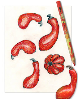
This project was a big success in my after school drawing class today. I started at Michael's where I found an assortment of bright red gourds and a marbled pencil crayon that matched their coloring perfectly, simplifying the process of coloring and shading for any age.
1. The gourds come in small sets. I scanned a handful and made color printouts for my youngest students. I wanted them to observe the shaded edges of each piece, but all students had the option of sketching from the real models. I demonstrated how to look carefully at the shape of each gourd, and had them draw several randomly across their paper. The stems were filled in with pencil, as the gray matched the real thing pretty well.
2. When the drawing was done, each student got a Koh-I-Noor Hardmuth Magic Wild Pencil (about $1.50) to lightly color in each gourd.
3. The students sketched firmly around the edges with their pencils, making a soft transition from dark to light, without hard edges. For added dimension, a small amount was erased to highlight the contours of each shape.
Medium shades, plus dark shadows and a little highlight can put any student on the road to more realistic drawing.
Read more »

Saturday, October 2, 2010

Vintage Halloween Mural

I've always enjoyed vintage Halloween art for its whimsical quality. I thought it would be fun to incorporate elements from my favorite pieces to make this, my first Halloween mural.

My pdf file consists of 30 pages and measures 40" x 60" when complete. I'll deliver my Halloween Mural via email, for just $5. Click the “Add to Cart” button for same day delivery.
Add to Cart
Read more »

Friday, October 1, 2010

Mark Rothko Abstract Art

Mark Rothko emerged during the 1940s to create a new and impassioned form of abstract painting. My goal was to have students make a simple abstract picture, and let the visual “weight” of each color determine their order.
1. I gave students pre-cut cardboard rectangles measuring 2.25" x 8", 3.5" x 8", and 4.5" x 8". They were labeled A, B and C respectively so A=smallest, B=medium, C=largest rectangle. On a 9" x 12" sheet of paper, they were to center and draw one of each rectangle, in any order. I recommended that they center and trace the two outside shapes first and then finish with the middle. (Click on the image to see an example.)
2. Ask the students to choose 3 oil pastels, preferably 3 that are very different from each other. All colors have a different visual weight to them – generally darker colors are heavy and brighter colors are light. Ask the students to fill the lightest weight color in the smallest rectangle, the medium in medium size and the heaviest in the largest rectangle. If the students on occasion have trouble deciding, encourage them to just make their best guess. The point is for them to start thinking of colors from a new angle, not to be worried about right or wrong answers.
3. Lastly, a fourth color is chosen and colored in all around the rectangles, overlapping on the edges to get a painterly look. Heavy coloring, as always, looks best. To learn more about Mark Rothko, go to Art Smarts 4 Kids, here .

Read more »