Total Pageviews

Thursday, September 30, 2010

Student Art from Georgia

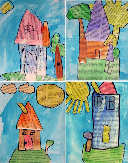
This student art was sent in by Laura Kim of Roswell, Georgia. She was writing to share what her students did with my Landscape Collage project, and I just adore the results, so whimsical and colorful. I would challenge any professional artist to match the personality shown in these. Below is Laura’s description of how her students created their art.

“First day we talked about landscapes and I had the kids paint a 9x12 paper with turquoise tempera cakes. After that, we talked about painting pages from an old book in an effort to recycle. I also talked about getting permission to rip up an old book. I demonstrated to the children how to paint one page green, one page yellow and then another page any ONE color of choice except for black (we used watercolors). If the kids finished all of this, then I kept allowing them to come and get pages to paint ONE color of choice until time ran out.

"The second week I placed their turquoise paper at their seat along with a yellow and green page (we painted as a collaborative effort). We discussed collage and I demonstrated how to cut out simple shapes and glue. They were allowed to come and get pages of other colors from the front table once they completed the grass and sun. We also did a lot of sharing!

"The third week we used a thick sharpie marker and outlined our shapes and added doors and windows if there were not cut and glued.”

Thank you so much Laura for sharing this inspirational work!
Read more »

Wednesday, September 29, 2010

Chagall Inspired Watercolor

Marc Chagall, one of the most successful artists of the 20th century, created many paintings that were a dreamlike, surreal tribute to his native village of Vitebsk. In order to have students connect with the idea of Surrealism, I’m going to have them create a painting that has some elements upside down, and some out of scale with each other.
1. I’m going to do a follow-along drawing with the students just to get them started with the idea of making a mixed up drawing. On a 11" x 15" watercolor paper, I will ask them to make a curved horizon line near the bottom third of the paper. A few buildings will be added on top (in my case, the entry to our school), along with some trees.
2. The top left or right is a good space for a large sun. It should be only half on the page, with some kind of face included.
3. The students then turn the paper upside down, and draw another large element in the space that is left over. My sample has a figure playing tether ball (a new addition to our school). Small figures, animals or cars may be fit in where possible.
4. When the paper is filled, all the lines are traced heavily with crayons of different colors.
5. The shapes are all painted in with watercolor. While the paint is still wet, some areas will be sprinkled with salt to create texture. When the painting is dry, the salt is brushed away.
Read more »

Tuesday, September 28, 2010

Art Journaling 131

I’ve been wanting to start a rubber stamp collection for the longest time, and finally broke down and bought a few at Michael’s for my next art journal class. The stamps can be a bit pricey but, they're so much fun to work with. This is a simple grid layout that I think all age groups can enjoy.
1. Given the size of my stamps, I’m going to guide the students to make a pencil grid that fits the largest and smallest of the stamps on hand.
2. Each student will be asked to stamp one image in each section, rotating them as wherever possible.
3. Some writing is added to each section whether it’s just the name of the leaf or a short poem or phrase.
4. Lastly, watercolor is used to paint around each stamp, taking care to leave a little space to keep the stampings dry to avoid running, while creating an enhancing halo .
Read more »

Monday, September 27, 2010

Kinder Portfolio Art Project

I found this art and book combination over at Teach Kids Art. The book by Peter Reynolds titled “The Dot” is short and sweet and has a wonderful art message. And the simple lesson of just painting lots of dots on a posterboard was fun without having a lot of directions to follow.
1. I prefolded 28" x 22" posterboard almost in half, leaving about 4" extending on one side. This is saved for the student’s name. (Make sure any shiny surfaces are on the inside as the paint will not stick to it.)
2. Each student received their posterboard face up, along with several spillproof cups of liquid watercolor. “Dip, dip, wipe, wipe” was explained for those new to painting, which helps to keep the brushes from getting overloaded with paint. Students practiced making large, medium and small dots, just like the little girl in “The Dot” book. They were allowed to trade their cups with their neighbors to get a variety of colors.
3. Being that readability was important for the names on these, I asked the teachers to print the students names carefully with a fat black Sharpie marker.
4. After the paint was dry, the sides were taped together with either a clear or colorful tape. These portfolios will help keep art safe until our fall art fundraisers are over.
Read more »

Sunday, September 26, 2010

Kinder Line Art Project

Starting a kinder art class with a book is very helpful in establishing focus but can also be an opportunity to merge the art lesson with their other studies. Kinders in CA start off the year learning about horizontal, vertical and diagonal lines. Finding just the right book can often be a test but, I think this one is near perfect. “Little Green” by Keith Baker has beautiful illustrations of a hummingbird flying in zig-zags, loop-de-loops, and various patterns across the pages.
1. Each student is given a large sheet of paper, 11" x 17" or so, and a thick black marker. Following my sample on the board, I have them draw a zig-zag line from edge to edge across the paper. Then, they add a loop-de-loop, a wavy line and a straight horizontal line.
2. They then draw one straight vertical line and one diagonal line, wherever they like. The result is lots of closed spaces to fill with color.
3. All spaces are to be carefully colored in. If your budget allows, try the new Crayola Slick Stix as they are truly oil pastels for the young. My kinders all say “they’re so smooth!” when they first try them out.
NOTE: I love the concept of merged lesson plans and I'll be posting about similar publications as often as I can. If you know of any, please share.
Read more »

Saturday, September 25, 2010

$25 Gift Card Drawing Winner

And the drawing winner is. . .Blog-on, who wrote:
That movie was simply...amazing. After each phrase, I thought, "that is SO true." I am a constant witness to it's true-ness...I adore every moment with my low economic status, non english speaking 2nd graders! They deserve wonderful life experiences...time and time again!

Congratulations and please email me your mailing address.
And thank you to Mudpies and Butterflies for sponsoring this giveaway.

My friend over at Mudpies and Butterflies is offering my visitors a chance to win a $25 VISA Gift Card just for watching a brief but poignant video homage to teachers. To enter, leave a comment about the video at this posting along with your contact information by Friday, Sept. 24th at midnight. I will randomly draw for the winner on Saturday, Sept. 25th.
Enjoy the video and good luck!

http://www.youtube.com/watch?v=d_pGiUeVFEU
Read more »

Friday, September 24, 2010

Watercolor & Crayon Name

You can give your painting skills a practice while you make a pretty sign for your home or classroom.
1. I recommend starting with some kind of watercolor paper as it will make a big difference in the brightness of the paint color. Working with a wide format paper, have the students draw five equal horizontal sections that are about the same width, using a pencil and ruler. Centering tip: Students mark the center of the paper and then figure out what the middle letters are in each part of their full name. In my case, I made my letter "T" in the middle, and then added the "KA" to the left, and "HY" to the right. They can do the same with their middle and last names, always making capital letters that touch the top and bottom of each line. The letters must be upper case to create closed spaces.
2. After the name is completely planned in pencil, the students are to trace the lines and letters in crayon, pressing hard to leave lots of wax.
3. Using watercolor paints, have the students paint in all the closed shapes they have made with bright colors. It helps to have lots of color choices so that not many colors end up being next to each other when finished.
Read more »

Thursday, September 23, 2010

Watercolor Alphabet

This was my after school watercolor project this afternoon, a crayon resist alphabet grid idea that I found over at artsonia.com. I wanted the students to learn that they can control where their paint spreads, by literally making little “walls” of crayon. This colorful painting was made by Lara, a talented 1st grader.
1. I started with 11" x 15" watercolor paper, and drew a grid out in pencil for each student. Five rows across and five down made 25 rectangles. I explained to the students that they were to write one letter of the alphabet in each, but needed to “cheat” in one of the spaces and squeeze two in to make all the letters fit.
2. After each student wrote their letters, they traced them with a crayon. I like the Crayola Twistables as they don’t get as dull as the regular kind. The grid lines were traced also.
3. Each student was given a small brush and a variety of liquid watercolors. I asked them to change color often and see how neatly they could fill in each rectangle. Any accidental bleeding though, I think just ads charm to the artwork.
Thanks for letting me share your picture, Lara!
Read more »

Tuesday, September 21, 2010

Art Journaling 131

I like to try new products on the market, and had fun today with Crayola’s new “Mixing Mediums”. They’ve made “Texture It”, “Pearl It” and “Glitter It” paint which are designed to add some special effects to your artwork. Adding the glitter paint to my journal leaf page added a nice little sparkle, and inspired my quote.
1. To draw a nice big maple leaf on my page, I followed the steps in my post “How to Draw a Maple Leaf”. When I was done, I traced my leaf with a black Sharpie.
2. My background is made from cut strips of tissue paper, which are glued down with a glue stick. I’m growing very fond of the purple variety as they let you see where you have covered, but dry perfectly clear. I worked from side of the page to the other, making a wide vertical strip of glue, tearing off and attaching a strip of tissue paper, and then repeating with another color. With a light touch, I rubbed a bit of glue over the tops of the strips to make sure there were no loose edges. Let dry for about 15 minutes, or until the stickiness is gone.
3. I traced the leaf again with a black Sharpie marker.
4. Lastly I filled in the leaf with a thin layer of the “Glitter It” paint. My inspiration for a glitter quote came at this time, so I added with my black Sharpie. Another option might be lots of smaller maple leaves, moving around on the page, or more words describing fall in general. It’s up to you!
Read more »

Monday, September 20, 2010

Contour Tree Drawing

I’m stilling enjoying the artwork of Friedensrich Hundertwasser, who inspired this contour drawing of a tree trunk.
1. I used a square paper and drew the outline of a tree trunk with a few finger-looking shapes pointing down. After adding a few vertical lines for definition, I made a series of curved, or “jumping” lines going across and filling up the trunk.
2. I drew a curvy horizonal line, and then filled in the ground below with more horizontal wavy lines that jumped across the tree roots.
3. Lastly the sky got a few wavy lines also. When the pencil drawing was complete, I traced all the lines with a thin black marker.
4. I chose a main pencil color for the trunk, ground and sky. After filling in those areas with medium pressure, I went back and filled in some random lines with darker and lighter versions of each color.

CA Visual Art Standard: Creative Expression, Grade Three
2.3 Paint or draw a landscape, seascape, or cityscape that shows the illusion of space.
Read more »

Sunday, September 19, 2010

Art Journaling 130

I am still on a quest to find simple layering techniques for my afterschool art journal class. Many detailed adult journals that I've admired have had as many as 5 or 6, but with students as young as kinder, I’ve found having them just focus on 2 layers is a good start.
1. This is intended as a title page for a new art journal session. I first traced my hand in pencil, and wrote the words inside.
2. I again used my favorite new watercolor paints, the Crayola Watercolor Mixing Set that I can only seem to find online. Love the violet and cyan that it includes! I painted the entire page with just some simple free-form blotches of color.
3. I took some white acrylic paint and watered it down, making it about the consistency of milk. I painted all around my hand, trying not to work the paper too much. The watercolor will start to mix with the white if you brush it too much. A little mixing is good, a lot might undo the transparent look.
4. When the paint was dry, I used a Sharpie to trace my hand and words so they would show up really well.

NOTE: In response to a question about which journals I like to use, I've settled on this Canson Field Sketchbook in the 7" x 10" size. The spiral opening is important, and the hard cover stands up to a bit of abuse. If you buy in bulk, they are about $9 each.
Read more »

Saturday, September 18, 2010

Pastel Indian Corn

Fall is full of colorful imagery, be it pumpkins or leaves or corn. For some reason, glue drawing on black paper with chalk pastels, seems to bring out the best qualities of all these materials.
1. On a 9" x 12" piece of paper, show the students how to draw a long rounded rectangle for their ear of corn. Save room at the top, where leaves are added. Horizontal and vertical lines are added for the ears of corn, and some kind of background may be added.
2. When the image is drawn, all the lines need to be traced with white glue. A yarn-size line of glue is ideal, but the blobs end up looking great too. Let glue dry until clear.
3. Using chalk pastels, show the students how to color in their image, taking time to rub the chalk into all the nooks with their fingertips. The chalk will stick to the paper, but rub off the glue.
Read more »

Friday, September 17, 2010

Line Pattern Leaf

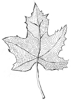
This is a study of patterns that could be simplified for kinder and 1st grade students. I drew my leaf and filled it in, but a large template to trace might help younger students get started.
1. If you make leaf templates from some kind of posterboard, I would make them large enough to fill a 9" x 12" paper. Stems could be left off and just drawn in, to keep things simple. To begin, the students trace the leaf in pencil near the top of the paper.
2. A stem is added at the bottom, and veins are drawn up the center to divide the leaf into many shapes.
3. The students are to fill in each section of the leaf with a pattern. Challenge them to think of as many different patterns as possible. I used a black ballpoint pen on my sample, but a very thin black marker would look nice too.

CA Visual Arts Standard: Kindergarten
2.1 Use lines, shapes/forms, and colors to make patterns.
Read more »

Thursday, September 16, 2010

Fall Leaf Butterflies

This project was inspired by Lois Ehlert’s beautiful book “Leaf Man”. A little technology, namely stock photography and a color printer, helped me to make dozens of flat, easy-to-cut and glue leaves.
1. If you are so fortunate as to live near some fall foliage, you can take the real thing to a color copier and make lots of prints of multiple leaves. Or if you are like me, nowhere near any maple trees, you can go to www.gettyone and search for “leaves, close-up”. Download the preview images, which are free, and print out on a color printer. I splurged and used photo paper as the color seems to be about 10 times brighter when I do.
2. Young students can cut out the leaves leaving about an 1/8" of white around the outside. The reason is that intricate leaf shapes can be tricky to cut right on the edge, but because the background will be white, it will look OK. Older students can be more precise and cut out the leaf exactly.
3. The leaves are then to be cut in half right down the middle, along the spine. The two sides are then glued down with a little space left in between. A body and antennae are cut from scraps pieces, or from leftover stems.
Read more »

Wednesday, September 15, 2010

Textured Fall Leaves

One of the California Visual Arts Standards for 1st graders deals with adding texture to art. I made these paper towel leaves to give this painting some very real bumps and wrinkles.
1. I used Bounty paper towels (I like the spongy look to them) and cut out about 3 large leaves and 4 small ones. Mix up a small amount of 50/50 water and glue. Dip the leaves, get them completely wet, and spread them on watercolor paper as desired. Let dry overnight.
2. Choose one crayon for each leaf and trace around the edge, pressing firmly. Add a stem at one end.
3. I made some extra watery watercolor from my tube set, and painted the inside of each leaf. Dabs of different color in each leaf can add some more interest. When complete, paint the sky. Some splotches are going to pop up from the glue and water, but I think they add to the un-fussy look of the picture. Finally I used a small stiff brush to add brown vein lines on each leaf.

CA Standards of Visual Arts: Grade One
2.7 Use visual and actual texture in original works of art.
Read more »

Tuesday, September 14, 2010

Kindergarten Hand Print Quilt

Brag alert! I was organizing my room and came across a long-lost photo of a quilt I made with my son’s kinder class. (He just entered high school, to put a time reference on this.)

For this project, each kinder got their own white panel of cotton fabric, which was taped to a piece of cardboard. They had help in tracing their hand with a fabric marker and writing their name on it below. To add a bit more color, each student was allowed to spray their fabric with some push-pump fabric dye that I found at Jo-Ann’s.


When the fabric was dry, I washed and ironed each panel to set the colors. I worked out a sewing plan as I went along, coordinating a colored edge around each panel, creating rows and then a border around the entire quilt. A bit of the edge is missing from this photo as the corners each had a yellow square in the center of a dark green square.

I recall that machine-quilting the front to a cotton back was not easy on my home machine, but it worked out in the end. I loved the finished quilt, and believe that it sold for about $350 at our school’s silent auction.
Not bad for ten years ago!
Read more »

Monday, September 13, 2010

Snowflake Resist Watercolor Grid

I was looking for a quick and colorful project for an upcoming holiday art fundraiser. I think this might work well for all skill levels involved as the drawing is made on one sheet of watercolor paper, then cut into panels, painted, and taped back together.
1. I started with a sheet of 8" x 10.5" sheet of watercolor paper. I used a ruler to measure and find the center point on all four sides, and then connected the points with a pencil to make four panels. A small number 1, 2, 3 and 4 was written in the top right corner to help match the panels later on.
2. Using a white crayon, I drew lots of snowflakes, taking care to have some large and some small, and some overlapping the panels. I like to make a large “X” and then add a horizontal line to form a six-sided frame, and then added circles and arrows to decorate. Pressure is needed to make sure that thick, white lines are drawn with the crayon.
3. I used scissors to carefully cut the four panels apart. My Crayola Watercolor Mixing Set® was my paint choice again. I used a different color on each panel and let dry.
4. I lined up the four panels to match their original layout, and taped from behind. Mounting on a white 8.5" x 11" paper would look nice too.
Read more »

Saturday, September 11, 2010

Follow Me on Twitter

twitter logo

Want to see what inspires me? I love collecting images on the internet for ideas and themes that I might find useful in developing new lesson plans. I’ve tweeted a few of them and there will be many more to come.
Read more »

Fall Pastel Landscape

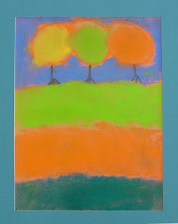
This kind of loose, simple landscape lets chalk pastels do what they do best – make smudgy, soft shapes.
1. Give the students a narrow sheet of construction paper, and instruct them to draw a ground line 1/3 of the way down. (Skip the pencil and just draw directly with the chalk.)
2. Next they should draw 3 round circles for the trees and fill them in with fall colors. Rubbing with fingers softens the shapes.
3. The sky background should then be colored and blended in.
4. Add clean dark lines for tree trunks.
5. Divide the ground area into three sections, color and smudge to soften.

Read more »

Thursday, September 9, 2010

Romare Beardon-Style Collage

Many art historians consider Romare Beardon to be one of America’s most important and inventive artists. Beardon loved collage, combining painting, magazine clippings, old paper and fabric together like a jigsaw puzzle. This project gives a nod to Beardon’s love of photos and texture, but also offers a kinder / 1st grade version of my “Collage Name Card” project.


SESSION ONE
1. Give each student a couple of colorful magazine pages, drawing paper, glue stick and pencil. The students are to center a large simple stick figure of their first name initial on the drawing paper, in pencil.
2. They then form their initial using approximately 1" wide magazine strips. Demonstrate how the magazine strips torn vertically, will stay be pretty even. The students are to trace their drawn initial with the glue stick, covering generously, and glue the magazine strips in place.
3. The students use a peeled crayon and a sheet of plastic canvas (sold at Jo-Ann Fabrics for about 50¢) to do a crayon rubbing with the side of the crayon, all around their collage letter.

SESSION TWO
1. The students use the Crayola Watercolor Mixing Set and water to paint just one solid color around their letter. When complete, they may take a paper towel to dab and speed up the drying process.
2. Finally, a small darker piece of peeled crayon is rubbed along the edges of the page.


Read more »

Wednesday, September 8, 2010

Back To School Portraits

I'd been looking for a different approach to self-portraits for a back-to-school project. I wanted something that would ask the students to see themselves in a new way, and create a colorful display that I knew the teachers would appreciate for their classrooms. Austrian artist Friedensreich Hundertwasser has an amazing life story, along with a very appealing style of abstract drawing. Click here to read more about him.
1. Start with a 9" x 12" paper, and trace the width of a ruler around the outside edges in pencil. Add another line about 1/4" away to make a narrow inner border.
2. Draw a very large circle that almost touches the top border and does touch the left and right. Wobbly circles are welcome! Shoulders may be straight or angled. Eyes are drawn by starting with a center dot, and then the football shapes that extend and touch the outside edge. Hair must be simple, simple, simple, using as few lines as possible. Names are drawn in block letters in the bottom border.
3. When the drawing is done, all lines are traced with a thin black marker.
4. Everything is colored in heavily with some good colored pencils. This sample is down Prismacolors.
Read more »

Tuesday, September 7, 2010

How to Draw A Maple Leaf

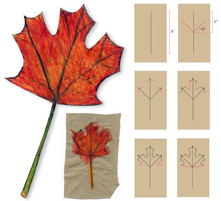
I love all things relating to the fall season, especially the wonderful shape and color of the classic fall maple leaf. It’s shape can look a bit complex until you break it down into steps. I made my leaf with grocery bag paper to give it a natural look and feel. Another lovely way to recycle.
1. Give each student approximately half of the seamless side of an average grocery bag to make a piece that measures about 7" x 11". Using rulers, they are to center an 8" vertical line.
2. Measure 4" from either end to find the center, and make a dot from which two “stems” are added at approximately 45 degree angles.
3. Small scallops are drawn at the tip of each line. They should all be the same size.
4. The 2 large“J” shapes connect the scallops. This shape should extend about half way down to the center point.
5. Two more “J” shapes are added with the ends of both just about level with the center point.
6. Gentle curved lines connect the outer points to the center point.
7. Add a second line to widen the stem so that it can be colored in. Small vein lines can be added, all to be traced heavily in pencil. Use colored pencils to fill in the leaf. Layer lots of fall colors and press hard to make a rich looking leaf.
8. Cut out carefully and display as desired.
Read more »

Monday, September 6, 2010

Over and Under Snake

Learning to draw overlapping shapes is the first step to working with depth. I found this project to be a fun way for students to think about what is in ‘front’ and what is in ‘back’.
1. Starting with a sheet of white drawing paper, the students are to draw one long continuous curved line that overlaps itself at least once, but no more than twice. When complete, they need to draw another parallel line next to it, at least an inch away. One end needs to have a head attached, and one end needs to turn into a tail. Whenever the snake crosses over itself, the student has to decide which part is in front, and erase the lines inside so that the snake no longer looks “see through”.
2. When complete, the drawing is traced with a thin black marker, and then colored in with oil pastels. Encourage the students to keep it simple as too many crossovers get confusing.
Read more »

Sunday, September 5, 2010

In Your Face Cow Drawing

This idea comes from a funny painting I found in a home decor catalog. I love how it exaggerates the proportions of the cow.
1. I started with a 11" x 14" drawing paper, and folded it in half four times to get a grid of guidelines like those shown on my diagram. Have the students start by drawing half of the head as shown on my diagram, and then adding the opposite side with as much symmetry as possible.
2. Tilted eyes are added at the widest part of the head. The top of the nose is added to make a nose that looks like a square with rounded corners.
3. Ears are drawn extending out of the top of the head, and as they are really large, going off the paper.
4. The body of the cow is added with legs below and the back above. You can give the students the option of drawing the body to the right or the left.
5. When the drawing is complete, the students trace the art with a black Sharpie and then color in with oil pastels. Encourage overlapping the edges of different pastel colors so they get a fuzzy look instead of any hard line.
Read more »

Saturday, September 4, 2010

Collage Name Card

Lately I’ve been inspired by scrapbook artists and the layered-looking collages they often create. I plan to start the school year with this Collage Name Card to let the students express their personalities, while making colorful artwork that can adorn their classrooms.
SESSION ONE
1. Cut enough 9" x 12" drawing paper into fourths measuring 4.5" x 6" to furnish each student with one page for each letter in their name. Also, pass out old magazines and have the students find pictures depicting things that they like such as favorite foods, colors, animals, etc. Demonstrate how the magazine paper, when torn vertically, can produce fairly even strips. They will then trim the lengths into pieces to form the letters of their names. Each strip is glued to the drawing paper with a glue stick being careful to leave no raised edges.
2. The students will use peeled crayons and a textured surface to make crayon rubbings around the letters, each with a different color. I use plastic mesh onion bags that I secure to chipboard.
SESSION TWO
3. I'll be using Crayola’s Watercolor Mixing Set. They have a new bright palette that works well for a watercolor resist painting. Each page is painted with a different color around each letter. Students should avoid mixing to keep the colors sharp and true. These paintings dry pretty quickly but dabbing with a paper towel can speed things up.
4. Once dry, the students will use small peeled crayons to rub around the edges of each page using a different color for each.
5. The students will need pieces of drawing paper cut 24"x 6" on which to mount the name pages. Each is glued to the drawing paper using a glue stick, working from left to right. Add paper for longer names and trim off any excess. Press under a stack of books to flatten.
6. When complete, the names can be hung on a wall or made to stand with a “Z” fold as pictured.
Read more »

Friday, September 3, 2010

Drawing Practice Sheets (50) Grades 3-5

The inspiration for these worksheets came from Mona Brooke’s book “Drawing with Children”. She explained that one skill needed for realistic drawing is the ability to look at shapes and draw them for what they are, not what students think they are.

I created this set of 50 worksheets for warm up exercises. The students copy what they see in the blank boxes below. These exercises serve as a quick and easy way to get the students to focus while helping to sharpen their cognitive and motor skills.

This collection of drawings is suitable for grades 3 – 5. All of the worksheet pages are numbered for your convenience. You can purchase my pdf file with instructions for just $5. Click the “Add to Cart” button below to make your payment and receive download instructions.

Add to Cart
Read more »

Thursday, September 2, 2010

Chalk Pastel Flowers

Georgia O'Keefe had a long and varied career but is mostly famous for her oversized flower paintings.
1. Let each student choose from a collection of large flower photos, possibly from old calendars. Instruct them to first sketch their flower in pencil, large enough to go near or even off the edges of the paper.
2. Chalk pastels are colored and blended into the paper. Recommend that large areas be colored first, and fine details on top go last. The background looks nice when colored in with a contrasting or complementary color.

Read more »

Wednesday, September 1, 2010

Van Gogh Pastel Sunflowers

This is a tribute to Van Gogh’s famous “Sunflowers” painting.
1. Instruct the students to draw a line for the table, and then the outline of a jar above it. Show them the jar in the original painting so they can add a curved middle line for dimension, and sign their name, in the style of Van Gogh.
2. Ask them to draw a series of circles for flowers, some large, some small, maybe some even going off the page. Add small petals around the flowers.
3. Connect the flowers to the jar by drawing stems, and add leaves.
4. Trace all the pencil lines with a medium size black marker.
5. Have the students fill in the shapes with good oil pastels. Show them that if they color everything very solidly, their picture will look much like an oil painting.
Read more »