Total Pageviews

Sunday, May 30, 2010

Patterned Hands

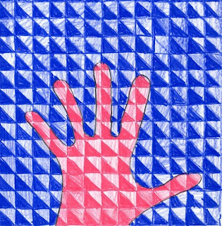
My experience in graphic arts enables me make up my own templates for new art projects. In this case I added a diagonal line to my graph, but alternating squares will work fine too.
1. Give each student a square paper that has the (lightly) printed 5/8" grid, with a diagonal line slicing through each box. Have them trace their hand in the middle of the paper, in pencil.
2. The students are to pick just two pencil crayons for their picture. In the example shown, the student chose pink and blue. She colored everything inside the hand pink, but changed the coloring density on the top and bottom triangles to make one light and one dark. If you have the students start by making just one two-tone box, and then repeat that pattern to the edge of the hand, it may be the best way for them to understand the pattern they are to make.
3. After the hand is filled in, the student should take the remaining pencil and fill in the background, following the pattern they began on the inside. For instance, if the bottom left corner is the darkest in the hand, the bottom left corner should also be the darkest outside the hand. Proceed until the paper is filled in. Note: This may take a couple of classes to finish but I think it's worth it.
Read more »

Saturday, May 29, 2010

Self-Portrait Painting

Years ago I taught my first self-portrait project in my son's 2nd grade classroom. They've since become a favorite of students and their parents and have served
as great fundraising tools. 1. I started with 5" x 7" canvas panels and an assortment of acrylic paint. It helps if you include lots of skin tones, as well as other bright colors when purchasing your paint. During the first class session, I had the students just choose one color and paint the entire background. Let dry for at least one day.
2. Distribute small brushes and paint. Ask the students to paint in an oval face and then a neck. A simple shirt is painted below and the hair is added around the face. Let canvases dry for at least another day.
3. Here's where I learned that it's too hard to paint lines on the face with a brush. You're better off passing out Sharpie markers for the features and signature on the chest when complete.
4. You can then attach all your 5" x 7" canvases to one surface, or as in my case, scan them to computer, make a collage and a nice glossy print for everyone in the class.
Read more »

Friday, May 28, 2010

3D Laurel Burch Cat

You can use this idea to turn any silhouette into a 3-dimensional shape. Just make sure you use a thick paper so your design will stand up nice and straight.
1. I love using Laurel Burch's cats as inspiration for projects, her style is so fun to imitate. I made a two cardboard templates of a silhouette (see picture) and had the students trace each onto the heaviest watercolor paper I could find.
2. Each student is to cut out their two cats, including the narrow slits. They need to be about 1/32" wide to accommodate the thick paper. Test sliding the cats together to make sure the slits are working.
3. The students may then draw in pencil their cat design, which they need to repeat on both sides of the two paper cats. When the design is done, they paint in the shapes and designs on their cat with liquid watercolor.
4. After the paint is dry, I gave each student a gold poster paint marker and had then trace all the pencil lines. When the marker is dry, slide the cats back together and enjoy seeing your cat from all directions!
Read more »

Thursday, May 27, 2010

Monet Water Lilies

Claude Monet (1840-1926) painted directly from nature and revealed that even on the gloomiest of days, an infinite number of colors can and do exist. To capture these fleeting hues, Monet created a new painting technique using short brushstrokes filled with individual color. The result was a canvas alive with painterly activity, the opposite of the smooth blended surfaces of the past. 
1. I presorted some oil pastels so that students had only yellow, peach, pink, light green and white available to choose from. As a follow-along drawing, I asked them to first color one large yellow lily (which is much the shape of a tulip) and then one medium and several small on a large piece of watercolor paper.  Peach pastel was added on top of each, as a kind of shadow, and then pink for a center. Light green ovals were drawn around the bottom of each lily. Lastly, lots of squiggly lines were added with the white pastel to look like waves.
2. I gave the students liquid blue watercolor, and asked them to paint over everything except the flowers. While the paint was still wet, they had a chance to add a bit of green watercolor in any areas they liked.
Read more »

Wednesday, May 26, 2010

Gold and Black Greek Vases

My quest for multi-cultural art continues, which has led me to a new media combo that I really like. It’s using food wrap paper like this, markers and tempera paint. I actually ran out of drawing paper and tried out this food wrap that was left over from an old project. It makes for a very “breezy” painting that doesn't wrinkle like the others. More tests to continue...
1. I had the students fold their 12" x 12" food wrap paper in half and crease. With a pencil, they could draw half of a large vase, preferably using up as much of the paper as possible. When complete, they traced it with a large, chisel-tip black Sharpie. With the paper still folded, they turned it over to see the lines showing through and traced again. When complete, the opened vase drawing should be symmetrical.
2. They students filled in their vases with decorations of the country, with either figures or plants. I asked them to draw lots of images, trace them carefully with the black Sharpie. Once completed, the negative space around them could be filled in black. The tops, handles and base could be colored or not at their discretion. Care needed to be taken to not rub hands through the marker while it was still wet as smears could occur.
3. When the vase was all colored in, gold tempera paint was spread over the entire vase, but not the background. I had thirty 5th graders do this today in 45 minutes, all with really bold and shimmery finishes. Can’t wait to see them hanging on a line outside the classroom tomorrow.
Read more »

Tuesday, May 25, 2010

Plants in a Jar

I'm always looking for new ways of using white crayons that “magically” appear when painted. This can be integrated with a science lesson on plants and root systems.
1. I cut jar templates from letter-size chip board and gave one to each student. Have them trace the jar in pencil on a 9" x 12" paper.
2. Limit the early crayon color selection to minimize mistakes. Students were to trace the jar in blue and draw a ground line in green. Then the plants could be drawn above the ground, and a root was drawn in white below. I found that going straight to crayon worked fine. Sometimes drawing in pencil and then tracing slows the process down. Lastly, flowers could be added to the plants. Emphasize that the coloring needs to be heavy so they should press hard throughout.
3. Distribute watercolor paints and tell the students to use different colors for their ground and jar and background.
Read more »

Monday, May 24, 2010

Joan Miro Watercolor Painting

Joan Miro was a Spanish artist who developed a very whimsical style back in the 1930’s. His painting called “People and Dog in Sun” is  fun to imitate by drawing stick figures, stars and circles.
1. Give each student a 9" x 12" piece of watercolor paper and pencil. They are to draw one large stick figure in the middle, preferably in some action pose. Miro often repeated shapes in his work so ask the students to add more shapes to their art but ONLY by using lines and dots. At least two of the shapes need to intersect (overlap) to make more shapes to color.
2. After the pencil drawing is done, the students need to trace it heavily with a black crayon.
3. I tried a new paint for this project - Dr. Ph Martin’s Inks. They are similar to watercolors but have a really intense pigment. They don’t cost too much, but they do stain clothes so I wouldn’t recommend them for young kids. Whatever you use, have the students fill in all the shapes they have made with a different color.
Read more »

Sunday, May 23, 2010

How to Draw a Cubist Portrait

Many 3rd graders in California learn that Picasso’s cubism was about seeing two sides of something at the same time. Here is a breakdown of steps that I use, which I hope are helpful.
1. Give each student a 9" x 12" piece of black construction paper. Have them fold the paper in half vertically so they have a middle line. Then they are to make a light pencil mark in the middle, and then in the middle of each of those sections as in Diagram 1.
2. A profile line is drawn down the middle, with the top of the nose hitting the top quarter mark, the bottom of the nose hitting the middle mark, and the bottom of the chin hitting the bottom quarter mark. The chin ends as a curve up and the neck line is added as in Diagram 2.
3. Profile features are added as shown in Diagram 3.
4. The face is completed with frontal view features. The chin and neck lines are added to symetrically match the right side as in Diagram 4.
5. After the pencil drawing is complete, the lines are traced with a black oil pastel, making the lines very fat. All the shapes are then filled in. Encourage the use of unusual colors.
Read more »

Saturday, May 22, 2010

How to Draw King Tut

This lesson can be a good supplement to a history lesson on Egypt.
1. Working with large paper (at least 11" x 17") have the students fold the paper in half vertically so that the face can be centered easily. Start by showing them how to draw a large "U" in the middle that is centered on the fold. A line closes the top, and another parallel line is added below.
2. The face may be filled in next. This can be a good time to review proportions of most faces. A key addition to making the Egyptian look is to add the lines on the outside of the eyes.
3. Add neck lines below the head, and a headpiece that curves in at the bottom.
4. Stripes are added to the headpiece. Encourage the students to draw one side and then do their best to make a symmetrical copy on the other.
5. Sharpie permanent markers are needed to trace all the lines. The gold tempera paint is very transparent and can just be painted over the lines. I gave the students a choice of painting the alternate stripes in either red or blue or purple.
Read more »

Friday, May 21, 2010

Ceramic Planter Face

Last fall I applied for (and happily won!) my first grant with this project that combines both art and science. I proposed that many elementary art standards include making a three dimensional sculpture, while their science studies often cover the study of plants. Making this ceramic planter and then planting seeds for hair makes watching the growth process just a bit more fun.
What I learned: Turning a slab of clay into a cylinder worked pretty well for 4th and 5th graders. Any younger and it was a struggle. I tried having K – 3 make a pinch pot with a face, but they too often turned into bowls with a face, which wasn’t the same concept. Here is what I did with the older students:
1.  I used a wire cutter to make about 3/4" thick slabs cut from a  block of clay. Each student was to take a plastic drinking glass (about 3.5" diameter) and cut a circle from one corner of the slab to be the base of the planter. The rest of the clay was used to cut the largest rectangle (about 4" tall) possible. My experience was that this rectangle would not quite be large enough to wrap around the circle base. The clay would have to be worked together and combined to make the rectangle approximately 11" wide by 4" tall.
2. Once this rectangle of clay was wrapped around the circle base, the students had to blend all the edges to make it look like a smooth, closed tube. At this point, a bit of soft wet clay could be attached to look like a nose, and the eyes and mouth could be added or formed by pinching. When complete, a drainage hole was punched in the bottom circle with a drinking straw. Let the clay dry in the sun for several days.
3. When the clay was dry, the planters were fired in a kiln.
4. After firing, students painted them with skin tones glazes, and they were fired again.
5. Lastly, peat moss and grass seeds were added to fill the planters. My sample has simple grass seeds, but it would be fun to see what kind of curly hair could be produced with other seeds as well.

CA Visual Art Standard: Creative Expression, Grade Four
2.3 Use additive and subtractive processes in making simple sculptural forms.
Read more »

Thursday, May 20, 2010

Scratch Art Landscape

You don't have to buy expensive scratch art paper, if you have some good oil pastels, you can make your own.
1. Give the students a heavy card stock sheet of paper, 8.5" x 11" is good. With a pencil, ask them to draw at least 3 simple upside-down curves to represent hills. Next they are to draw a circle sun somewhere in the sky, and then add concentric circles around it until the sky is filled. No houses or trees are needed.
2. Next the pencil lines are to be traced with a fat, black sharpie.
3. Ask the students to color in all the shapes with oil pastels, coloring slowly so that no paper shows when complete. Bright colors are best (yellow, red, orange, green and blue). No blacks, browns or navy as they won't contrast enough from the upcoming black.
4. Each student is to color over their entire picture with black pastel, the darker the better.
5. With a wooden stick, the black can be scratched away to reveal the bottom colors. Encourage the students to make their lines go in different directions to create the maximum amount of “energy” in their drawing.
Read more »

Wednesday, May 19, 2010

Mexican Landscape

Diversity Day is approaching, so I’m trying to integrate each classroom’s chosen country into their art lessons. No small task, but for some reason I enjoy the challenge. A second grade class made this drawing today, which was an exercise in drawing close shapes large and far shapes small.
1. I started with colored paper so that the houses could be colored a nice, bright white. With a pencil, a horizon line was drawn about 1/3 of the way down the paper. I asked the students to draw a vertical wavy road, and then add at least three houses along that road. The closest house was to be the largest, the next smaller, and so on. I demonstrated some simple examples of Spanish-style houses with tile roofs and wooden doors. Trees could also be added, keeping the close ones large, etc.
2. When the drawing was done, the pencil lines were traced with a fine tip black Sharpie.
3. Lastly, all the shapes were colored in with colored pencils. The students seemed to enjoy this project more than most so I'm going to maybe try variations of it in the future. 

CA Visual Art Standard: Creative Expression, Grade Two
2.3 Depict the illusion of depth (space) in a work of art, using overlapping shapes, relative size, and placement within the picture.
Read more »

Tuesday, May 18, 2010

Delaunay Marker Drawing

Sonia Delaunay was a ground-breaking female artist who made some wonderful abstract paintings known for their rhythm and color. My goal was to have the students learn that if they used repeating shapes and colors in their art, they could create a very rhythmic picture too.
1. I found a vital piece of equipment at Michael’s, a circle scissor that helped me make dozens of circles from 1" to 6" wide out of card stock paper. I passed out both the inside and the outside circle shapes to trace, along with a ruler. The goal was to have a picture filled with shapes that are limited to full circles and half circles, but no other kind of splices. The best way to control this is to ask the students to trace one large circle and one smaller one in any placement on their paper. A center dot is drawn in the middle of each.
2. With a ruler, the student is to draw a line through the center dots.
3. More circles can be traced and added inside and out, but always centering them to the best of the student’s ability.
4. We used good old Sharpie markers for coloring, and I had the good fortune of having some coated white paper on hand. It really made the markers glide on, but I bet that regular paper would look just as nice. Remind the students that they are to have repeating colors. Each marker should be used in at least 3 different places. I personally love how these drawings came out – wish I could make giant posters out of them!
CA Visual Art Standard: Creative Expression, Grade Four
2.6 Create an original work of art emphasizing rhythm and movement....
Read more »

Monday, May 17, 2010

Scherenschnitte-style Drawing

Scherenschnitte, which means “scissor cuts” in German, is the art of papercutting. This work often has lots of symmetry, and common forms include silhouette and portrait images. I needed a German-themed art project this week, so I had my 4th graders draw a bold German mask to imitate the look of Scherenschnitte, as sharp scissors or knives were not an option for this age group.
1. One of my biggest internet finds last year was ClipartETC.com. They have thousands of etching-style drawings that are very easy to browse through. I decided to use several of their German mask images, like this one, and printed the largest out on a letter-size paper. Because the mask images tended to have shading on one side and not the other, I asked this students to fold the paper in half, leaving the unshaded side of the mask showing on the top. 
2. The students placed a sheet of tracing paper on top of the folded paper and drew in pencil half of the printed mask by tracing all the edges they could find.
3. When the half-mask drawing was complete, the students refolded their tracing paper so that the pencil was on the inside, and they could trace the other side of the face on the blank half of the paper. The goal was to have a symmetrical face drawn on the tissue paper, even if the pencil lines did not end up on the same side.
4. When a symmetrical face was showing on the tracing paper, a large black Sharpie was used to trace all the lines, making them as thick as possible. The thicker the better, to imitate the look of cut black paper that was cut away with a blade.
5. When the mask drawing was complete, a frame was added around the outside, one that touched all four edges of the drawing.
Read more »

Sunday, May 16, 2010

Mandala Drawing on a CD

A mandala is an abstract design that is usually circular in form. In fact, “mandala” is a Sanskrit word that means “circle”. Mandalas generally have one center point from which radiate an assortment of shapes and designs. Radial symmetry is the cornerstone of any mandala design.
1.  I wanted to start with a bright background on my old CD, so I spray painted it white until it was totally opaque. After it was dry, I brushed it with some watery glue to make a more slippery surface. I learned that would help keep my markers from plugging up later on.
2.  After the glue was druy, I used a ruler and pencil to kind of estimate lines that would divide the CD into 8 equal sections. (I plan to give my students templates to trace to help them make straight, even lines.) I drew a line through the middle of the CD to split it in half, then another perpendicular to it to make 4 equal sections. Lastly I make marks around the center hole at what looked like the middle, and drew a line through it to make what looked like 8 pretty even sections.
3. Starting with just one section, I drew simple diamonds, circles, leaves and curves to fill it up. When complete, I repeated the shapes in the same manner until all 8 sections matched each other. After the pencil lines were done, they were all traced with a fine tip black Sharpie marker. Lastly, the shapes were all colored in with Sharpie markers, taking care to keep the colors all symmetrical. 
CA Visual Arts Standard: Grade Two
2.5 Use bilateral or radial symmetry to create visual balance.
Read more »

Saturday, May 15, 2010

Folk Art Bird

One of the main features of Folk Art is that it is made by untrained artists. In this lesson I encouraged students to paint and draw with a very rough and sketchy style. This time, neatness doesn't count!
Week 1: Give the students large pieces of butcher paper, about 12" x 18". They are to paint a one-color large bird in the middle, in profile. The background gets painted black, deliberately leaving a bit of paper edge around the bird and the paper edge.
Week 2: With oil pastels, the students are to add detail to the bird, such as legs, eyes, beak, etc. The background is to be filled with lots of line patterns. Finally the painting gets glued to a larger paper, and border patterns are drawn on that too.
Read more »

Friday, May 14, 2010

Mondrian Watercolor Painting

Piet Mondrian became a master of geometric shapes in abstract art. There are many ways to imitate his style of painting, but I like this one best as the crayon naturally creates a wall between the watercolors.
1. With a ruler, the students are to draw lightly draw about 4 parallel horizontal lines across a piece of watercolor paper, and then about 4 vertical lines.
2. Ask them to randomly erase about 4 sections of the horizontal lines.
3. Next the students need to add about 5 lines, in any direction, chopping up any the the large rectangles to make some small ones. The goal is to have relatively even amount of large, medium and small shapes when complete.
4. Give each student a black crayon and have them trace all their lines, pressing heavily to make a dark line.
5. Each student then needs the three primary watercolors: red, blue and yellow. When painting in their squares, they are to consider the balance of each color (including white) so that there is not a concentration of any in any one area.
Read more »

Thursday, May 13, 2010

Cityscape with Clouds

I keep learning the importance of keeping new techniques simple, simple, simple, especially when working with 5 and 6-year olds. This week my afterschool watercolor class made a cityscape with lots of puffy clouds.
1. I gave my students 11" x 15" watercolor paper, a pencil and lots of scrap cardboard rectangles. After drawing a ground line, they could arrange and trace the rectangles however they wanted to create their cityscape. Roofs, doors and windows were added in pencil before the oil pastel tracing was done. I like pastels instead of crayons because they just make a more intense outline.
2. After the tracing was complete, the buildings were painted in with their favorite colors. Older students could add layers to their cityscape to start to work with depth and perspective. I again used my Crayola tablets dissolved into spillproof cups so the students could paint directly with liquid paint.
3. Lastly the sky was painted blue. I demonstrated that if they took a crumpled up tissue and dabbed at their sky while still wet, a cloud would appear. The more dabbing, the lighter the cloud. Simple, but effective as every student walked away with a “cloudy” painting. Wish my success rate was always that high!
Read more »

Wednesday, May 12, 2010

Animals Eyes

Learning how to draw well involves paying attention to detail, which is what this project focuses on.
1. Color copies of enlarged animal eye photos are needed for each student. If you have a color printer and access to the internet, go to www.gettyone.com and search for animal face photos. Or if you have magazines and a scanner and color printer, you can make your own. A variety of eyes from fish, tigers, elephants, etc. are helpful so the students can choose one that they find most interesting.
2. Crop the photos so that they are all in a square format and draw a line through the middle in both directions. Give the students a square blank paper that is a larger than the photo, and ask them to draw a line through the middle in both directions.
3. Demonstrate how the students can see where the lines intersect shapes in their eye photos, and if they draw the shapes in the same place on their blank paper, they can make a fairly accurate enlargement.
4. After the eye shapes are all drawn in pencil, ask them to color in the entire eye with the necessary colors in pencil crayon.
Read more »

Tuesday, May 11, 2010

Cliff Dwelling Landscape


I found this landscape to be especially successful with boys, who love the idea of drawing their own fortresses with ladders, windows, etc.
1. Hand out 18" x 12" sheets of drawing paper. Starting on one side of the paper, demonstrate to the students how to draw a continuous line with perpendicular angles up and down to create the first layer of buildings. Students should only draw with a chalk pastel as pencils tend to lead to too much detail. This line should generally be near the bottom section of the paper. The students are to fill in this layer in with color, and blend the color into the paper with their fingers.
2. Next they draw another building line from left to right, a little higher up, taking care to make it different from the first. They fill in with color and blend again.
3. Next, the background sky is to be filled in with color.
4. Large permanent markers are needed to draw and color random rectangles to represent windows. Ledges may be added, along with ladders that connect the two.

Read more »

Monday, May 10, 2010

Paint and Trace Watercolor Flowers

This project worked well for kinders through 5th grade last week. I basically had students draw or “fill in” the flowers first with their paint brushes, and then trace the edges afterward. My other projects almost always begin with traced drawings so this backwards approach gave the students a different perspective and different results.
1. With medium size brushes, liquid watercolor paint and white card stock paper, I had the students paint three flower tops and then a few stems and leaves below.
2. To keep this a one-class project, I handed out paper towels and had the students gently apply it on top to absorb any extra paint. This sometimes lightened the image, but it still looked pretty.
3. Lastly, each student took a fat black Sharpie and traced the edges of their flowers. I encouraged them to add extra details, such as folds in the flower leaves, and little bugs or insects on the side. This can be a pretty and quick project, if you need one. My experience was that most kids finished it in a half hour at most.
Read more »

Sunday, May 9, 2010

Watercolor Scaredy Cat

One of my goals with my afterschool watercolor class is to teach students that they can control the paint if they pay attention to when their paper is wet or when it is dry. This cat has clean edges because it's painted on dry paper. The stripes are fuzzy because they were added while wet.
1. My class is large and full of kinders so I gave the students a paper with the outline of the cat head drawn in pencil. I think 2nd or 3rd graders could do this step themselves. I did a follow-along drawing on the board showing students how to make the arched back, belly and legs, and then the tail and face details.
2. Once the drawing was complete, I passed out oil pastels for the students to trace over the pencil lines.
3. My handy-dandy liquid watercolors were dispensed, with one of each color to a table. I asked the students to choose one main color for their cat, filling it in with lots of wiggly painting. It was OK to go outside the pastel line a bit. While the body was still wet, they could chose a second color to paint stripes or spots. These lines should turn fuzzy on their own, but only if the paper is still wet.
4. Finally, the background was painted in. I made it optional for them to leave a bit of white space around the cat. The purpose was to limit the amount of bleeding that might happen, but some students were bothered by this idea of unpainted space, so I let them chose how to finish their painting. All in all, I saw a lot of creativity from this somewhat controlled process, so I plan to do it again.
Read more »

Saturday, May 8, 2010

House Collage

This is a fill-in-the-blanks kind of challenge for students, which can be easier than starting a drawing from scratch.
I looked online for architecture photos, and printed them out in black and white. You could also just xerox magazine photos. Look for a variety of images, making sure to have a selection of house parts including windows, doors, roofs. And feel free to include some landscaping too.
2. Give each student a paper (could be black or white), a selection of photos, and glue stick. They are to take about 5 or 6 different house parts, cut them out and glue them down with space between each.
3.With colored pencils (I like these from Dick Blick), the students are to draw the missing parts of the house, making sure to connect all the elements that have selected. In other words, the house is like a puzzle with missing pieces that they must create. Encourage them to color not only in the blank spaces, but ON the black and white photos as well. The more color, the more cohesive the artwork will become.
Read more »

Friday, May 7, 2010

Finish the Doodle Picture

I found this wonderful exercise at illustration.com. Try giving your students a page with several unfinished doodles, and just watch what they come up with!
1. I gave one doodle sheet to each student – even as young as 1st grade – and told them the line drawings were just the beginning of something that they were to finish. If they had trouble seeing something, they could rotate the paper until some other ideas came.
2. Have the students draw the image in pencil, trace with a black marker, and color in with colored pencils. I can still recall my favorite drawing where a young girl not only saw a rabbit, but a rabbit hiding BEHIND a rock. Too clever!
Read more »

Thursday, May 6, 2010

How to Draw a Cat

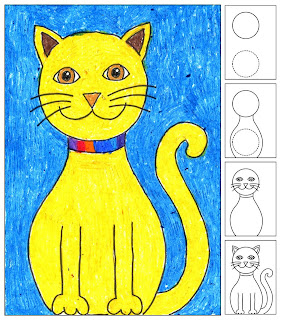
I've never had a student say that they didn't want to draw a cat. They make a great subject matter for boys and girls of all ages.
1. I first made 3.5" cardboard circle templates. Each student was instructed to place their circle near the top left of an 8.5" x 11" paper. The circle is traced, and then slid down near the bottom of the paper, and traced again, very lightly.
2. The cat body is drawn by making curves that go from the neck down, adding space around the circle. The reason for this is that we want the bottom of the cat to be wider than the head. When complete, erase the bottom circle.
3. The eyes, nose, mouth, collar and whiskers are added.
4. The tail and leg shapes are added.
5. When the drawing is complete, all the lines are to be traced with a thin black marker. Lastly, the cat is colored in with oil pastels. Encourage a wide variety of color, and a lot of contrast between the cat and the background.
Read more »

Wednesday, May 5, 2010

How to Draw a House

I had great success with this project for kinders recently. Several even came back later saying they went home to draw more houses. Love it when that happens!
1. I printed out 1/4" graph paper on 17" x 11" paper to help the students draw straight lines. Using just plain white paper would probably be fine though too. Start by showing the students how to draw a straight horizontal line for the ground. A basic house shape is added above it, sitting a bit to the left of the paper.
2. Show the students how to draw two horizontal lines for the edges of the roof. If possible, ask them to make them approximately the same length.
3. Starting at the top line, the two ends of the roof need to be connected and then a straight vertical line goes down.
4. Now the details of door, windows and sun may be added. All the lines are traced with a thin black marker, and then shapes are colored in. Encourage them to include the background so the image has lots of color.
Read more »

Saturday, May 1, 2010

Felt-Covered Journal


This project is good for smaller groups as it requires purchasing a few items, albeit inexpensive ones.
1. Gather or buy chip board and cut to a 6"x9" size, two for each student. Cut 9"x12" drawing paper in half to match the chip board. Place about 1/2" stack of drawing paper between the boards and take to Staples or the equivalent to have wire bound on one side. Have one book made for each student.
2. Cut oversized felt rectangles and pin together to make two sleeves for the book. Show the students how to make a whip stitch around the cardboard edges with colorful embroidery floss. When complete, pin and stitch the two sleeves together on the binding edge.
3. Using the felt scraps, show the students how to cut out decorative shapes and attach with fabric glue.

Read more »